|
|
|
FreeMeter contains 10 different meters. FreeMeter Professional adds 9 more. You
determine which ones you want to see, the order in which they appear, and their size.
You can hide the FreeMeter window by double-clicking the title bar. To unhide it, double-click any
FreeMeter system tray icon or use the hotkey combination you specified (Pro version
only). While hidden, all the meters continue to gather data.
If the FreeMeter window is hidden under other windows, single-click any FreeMeter system tray icon
to bring it to the top.
Right-click the title bar or any meter for more options.
Each meter has a button on the far right that will reduce the meter to a single line. Meters in this
state continue to gather data, they just do not display it.
|
|
FreeMeter has four timers that control how often meter data is updated. The Professional version
adds one more timer for the Ping meter. You control these timers and assign them to meters in the
Preferences dialog. One timer is only for the Volume Space meter. And another, only for the Ping
meter. The other three are for all the other meters. Typically, you set one of the timers to update
frequently and assign it to meters monitoring data that changes often, like CPU, disk, and
network. You can set this timer to update multiple times a second. The other timers you set to
update less frequently and use them on meters where the data does not change often, like the
memory meters or process meter.
In FreeMeter Professional, if you have the first timer set to update multiple
times a second, you can have that automatically reduced to once a second if a Remote Desktop
connection is detected. This reduces FreeMeter's use of Remote Desktop bandwidth since meters
will be redrawn less often. Once the Remote Desktop connection terminates, it will switch back
to multiple times a second.
|
|
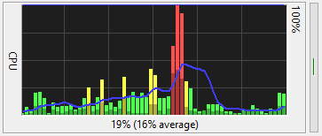
In all bar graph meters, a red bar indicates high utilization; yellow, warning; green, normal. Each
graph can also have a blue moving average line. In FreeMeter Professional, you can
change the red/yellow/green limits and you have control over all the colors in the graphs,
including the background color.
|

The Uptime/Runtime meter can display three things:
- Uptime: The amount of time the system has been running since it was last booted. This time comes
from the operating system. When the system is asleep, the uptime clock continues to run.
- Runtime: The amount of time that the instance of FreeMeter has been running.
- Sleep time: The amount of time the system has been in a sleep state. The OS does not keep track of
sleep time, so FreeMeter has to do it. FreeMeter can only track sleep time while it is running.
Quit FreeMeter, and sleep time resets back to zero.
Uptime is always shown. Runtime and sleep time can be individually turned on/off.
|
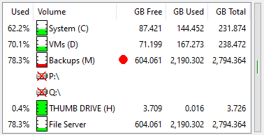
The Volume Space meter shows the status of the storage volumes being monitored.
You choose which columns to display and the order in which they appear. You can display GB or TB and
set the number of decimal places. You can monitor local drives and network shares.
Double click a volume to open an Explorer window on that volume. Right-click a volume and select “Show
Folder Usage” to view the individual folder usage on the volume (FreeMeter supports one folder usage
window at a time, FreeMeter Professional supports multiple).
In this example, the “Backups” volume is red because its free space has dropped below the set warning
level. Drives P:\ and Q:\ are crossed out because they are currently unavailable.
|
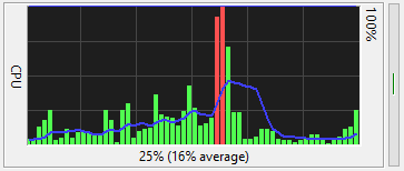
The CPU meter shows the percentage of time that all your computer's CPU cores are busy. It can be a
bar graph or line graph and can be drawn with or without the blue moving average line.
The top example is from FreeMeter. The bottom example is from FreeMeter Professional.
In FreeMeter Professional this meter can graph user and kernel CPU use separately -
kernel time is drawn in the darker color. The CPU is in user mode when it is running application
code, like Notepad or Microsoft Excel. It is in kernel mode when executing operating system code.
|
A Note About Windows Task Manager: On newer versions of Windows, if you compare
FreeMeter's CPU graph to Task Manager's CPU graph, you will likely notice that they can look very
different. This is because Task Manager does not report simple CPU utilization like FreeMeter
does, it shows what is sometimes called CPU utility. Task Manager is trying to take into account
that CPU cores may be running at reduced clock frequency or may be turned off entirely. If over the
past second all your CPU cores were working for a total of 0.4 seconds, FreeMeter will report that
as 40% utilization while Task Manager may show it as 60% or maybe 80%.
This article
goes into more details about what Task Manager shows — you might want to jump to the end of the
article and read the paragraph that starts with “The bottom line is”. You can also run Microsoft's
Process Explorer
and bring up its CPU graph (click the mini-CPU graph in the toolbar) and you will find that it
matches what FreeMeter shows, not what Task Manager shows. It's not that one is right and the other
is wrong, they are just interpreting the data in different ways. But if FreeMeter is showing you 50%
CPU utilization, then you know that your CPU cores are spending half their time working and half their
time idle, regardless of what clock frequencies they may have been using. If Task Manager is showing you 50%
utilization, who knows what that actually means.
|
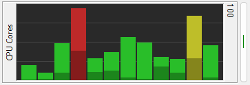
The CPU Cores Graph meter shows the utilization of each CPU core. Like the CPU meter, you have the
option to show user and kernel CPU use separately - kernel time is drawn in a darker color. You
can show the cores in numerical order, core #1 on the left, or sorted by use, most active core on
the right.
|
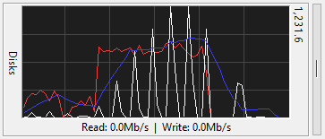
The Disk Graph meter shows your disk performance. It displays the rate at which your computer is
reading from and writing to all of your disks.
There are separate lines for read (red), write
(white), and moving average (blue). The moving average is based on whichever is
higher, read or write. In FreeMeter Professional, you have control over all the
colors in the graph.
The number in the upper right corner is the graph's upper limit. The graph will continuously rescale
to show all the recorded data. In FreeMeter Professional you can sync the disk and
network meters so that they are both showing the same scale.
|
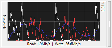
The Network Graph meter shows the network traffic on your computer. It displays the rate at which
your computer is receiving and transmitting data on one of your network connections. In
FreeMeter Professional, you can have two network meters running. On a notebook,
this allows you to have one meter for your wired connection and another for your wireless
connection. On a server, you can have one meter for your primary network and another for your
storage area network (SAN).
There are separate lines for read (red), write
(white), and moving average (blue). The moving average is based on whichever is
higher, read or write. In FreeMeter Professional, you have control over all the colors in the
graph.
The number in the upper right corner is the graph's upper limit. The graph will continuously rescale
to show all the recorded data. In FreeMeter Professional you can sync the disk and
network meters so that they are both showing the same scale.
|
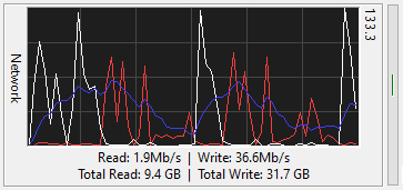
In FreeMeter Professional the network meter can show the total bytes sent and
received on the network interface. You can choose between showing the totals since the computer was
booted or since FreeMeter Professional launched.
|
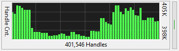
The Handle Count meter graphs the total number of open handles over time. A handle is a token that
represents a resource that is being managed by the Windows kernel. A handle can be to a window,
a file, a block of memory, etc.
|
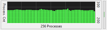
The Process Count meter graphs the total number of running processes over time.
|
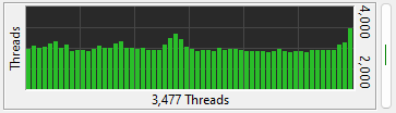
The Thread Count meter graphs the total number of running threads over time. Threads belong to a
process. Processes can have multiple threads.
|
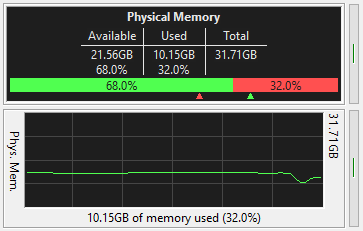
These two, separate meters show your physical memory usage. One shows it as text, and the other as a
graph.
The text meter shows current memory usage. You control what data appears in the meter. It contains
a horizontal graph of the current usage, available memory on the left, consumed on the right.
The two chevrons under the graph track how far over each side of the graph has gone.
The graph meter shows memory usage over time. It can be a line or bar graph.
In FreeMeter Professional, you have control over all the colors in both meters, and
in the text meter you can choose between the small font shown in the example, or a larger font.
|
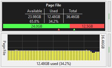
These two, separate meters show your virtual memory usage. One shows it as text, and the other as a
graph. If the OS increases or decreases the size of a page file to meet memory demands, the change
will be reflected in both of these meters.
It shows the amount of memory currently committed by the system and the total amount available. The
total is the amount of memory that can be committed by the system without extending the page file.
This number can change if page files have grown, shrunk, or been added.
In the text meter, you control what text data appears. It also contains a horizontal graph of the
current usage, available space on the left, consumed on the right. The two chevrons under the graph
track how far over each side of the graph has gone.
The graph meter shows virtual memory usage over time. It can be a line or bar graph.
In FreeMeter Professional, you have control over all the colors in both meters, and
in the text meter you can choose between the small font shown in the example, or a larger font.
|
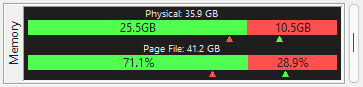
This meter shows horizontal bar graphs of the current physical and virtual memory use. You can
choose to display the available/used data as GB or as a percentage. The chevrons under the graph
indicate how far over each side of the graph has gone. (This meter was introduced in v2.27.0.)
|
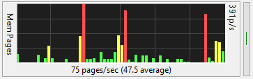
The Memory Pages/sec meter graphs the rate at which pages are read from or written to the paging
file on disk to resolve hard page faults.
This meter is a primary indicator of the kinds of faults that cause system-wide delays. If this
meter shows a lot of activity when your computer is being sluggish, you may need more physical
memory. If your system has lots of memory, this graph may show little to no activity because your
system rarely has a page fault.
|
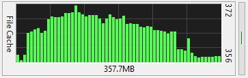
This meter graphs the size of the file system cache. This is the total size of all files currently
in the cache. It is not a graph of available file cache space. All unused memory can potentially
be used to cache files.
|

The Process meter shows a list of running processes. If the FreeMeter windows is wide enough, it
will show the total CPU time consumed by the process, the amount of memory it is using (its
“Working Set”), and its current CPU usage. If the FreeMeter window is not wide enough, not all
of this information will be displayed.
You control how many process show in the meter and their sorting order. You can have it tag
which processes are 64-bit processes, and which are 32-bit processes.
FreeMeter can only monitor processes that your user account has permission to read.
|
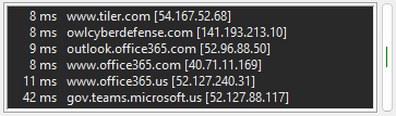
The Network Ping meter pings a list of local or remote hosts to determine which are up and which
are down. It displays each host's response time. The longer the time, the slower the network
connection to that host.
If a host does not respond within your time limit, it will turn yellow. If it is not responding at
all, it will be red. As with all meters, you can change the colors that are used.
You can specify the timeout, the maximum number of attempts to ping each host, and the minimum
number of responses that must be received for the host to be considered up.
|
|

 meters